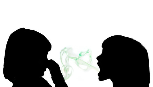
| This is a brief overview on how I went about creating the bad breath photo illustration. First step was to visualize bad breath. I went though about ten different concepts before settling on this one. I needed silhouettes and green smoke that looked like bad breath emanating from a mouth.
The two silhouettes are easy. Problem is how to shoot the smoke. The first tests the week before told me that I needed to do a composite photo since there was just not enough smoke at scale with the human head to make it look good. After I realized I needed to do a composite photo it was a matter of just setting it up and editing. These were all shot with my D200 and Nikon 50 mm 1.8. PHOTO 1 raw: |
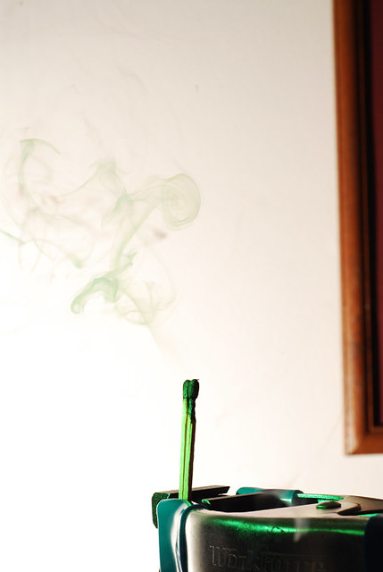 |
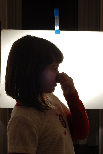
PHOTO 2 raw: Now I needed the photo of a person holding their nose. This is where my middle daughter came in. Had her stand in for this shot. This shot was very simple. 1 strobe aimed at the back at full power. Now I had a silhouette and white background. Again this is straight out of the camera. |
 |
|
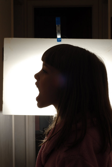
PHOTO 3 raw: Now it’s my oldest daughter’s turn. I needed the photo of a person with their mouth open. Same setup as previous shot. Again this is straight out of the camera. |
 |
|
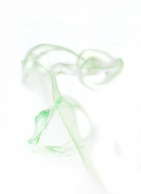
PHOTO 1 edited: Here is the edited shot of the smoke. It was cropped and I dodged out some of the smoke on the left to tighten it up. Then boosted the contrast and dodged some of the areas right around the smoke in order to match the white background. At this point the smoke looked great but wasn’t green enough. So I decided to edit the green channel in curves. That did the trick. |
 |
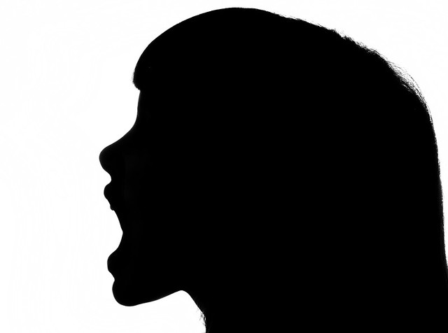
| PHOTO 3 edited: Here is the edited shot of the subject with the bad breath. This was a simple edit. It was cropped and then boosted the clarity and contrast. That was it. |
 |
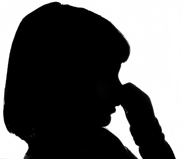
| PHOTO 2 edited: Here is the edited shot of the subject holding their nose. Same edits as the photo above. |
 |
| FINAL IMAGE: At this point all that was needed was to combine all three together in one image, line up the heads, and flip the smoke to horizontal. Easy as that. |
 |